Friday, August 13, 2010

Second try at product photography

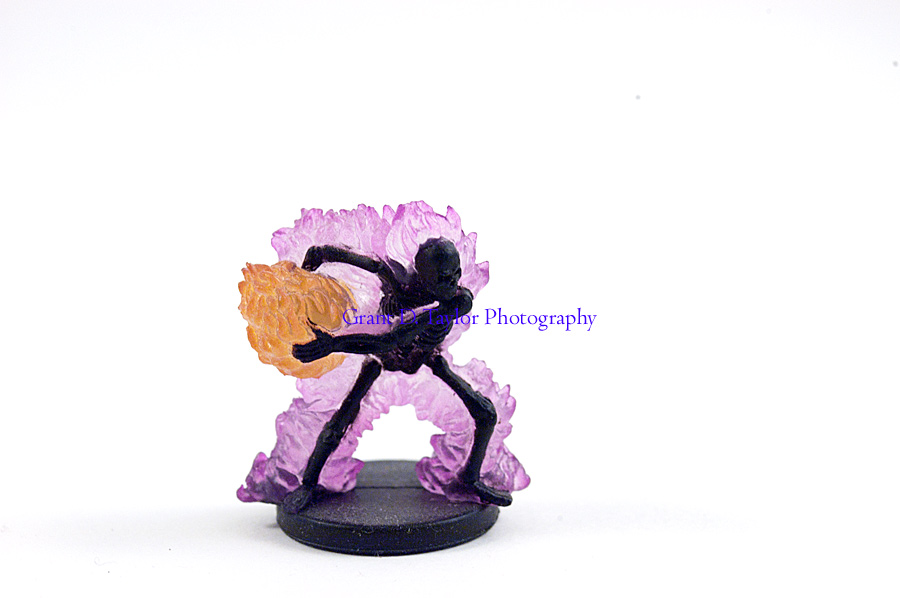
My second attempt at product photography I was much more successful. I balanced out the lights on each side to reduce the shadows. The right side was still a little bit stronger but that will be easy to balance out. I used Raw settings to get a good white balance. The biggest problems I have now are camera shake and front lighting.

This image is out of focus. I was using a tripod with a long shutter speed but I think that the camera moved slightly when I pushed the button giving the slight shake. The front of the figure was also much to dark and had to be digitally enhanced. My lights were slightly pointed forward giving a shadow across the face. I need to add a third light to give a little light on the front, nothing strong.


I need to set the timer on the camera for a few seconds after I push the button to allow the shake to go away. A light near the front with a indirect source will help with the front be light up.

A photograph is usually looked at - seldom looked into.  ~Ansel Adams

Thursday, August 12, 2010

Setting up a studio.

I decided to convert the spare bedroom at my house into a Partial Photo studio. I wanted to post images to share it with everyone.

This are just a few snapshots I did after finishing a practice shoot for an upcoming blog post. I have several more lights I can put to use besides just these 3. I think I have 11 lights total I can use. The largest problem is that the room gets very, very, very hot with even just these 3 lights running. I will have to see during the day how the light from the window affects my images. The window faces north so it should not be a problem and might even be able to be used a little.

Someday I hope to have a full studio with a portriat area and photos on the wall, for now I will love what I have.

If I could tell the story in words, I wouldn't need to lug around a camera.  ~Lewis Hine

Organizing Photos, Part 2

Recently I finally came up with a system for organizing my photos on my computer. I spent a long time trying to figure out the perfect organization method. I am going to share the method with you. The only program I used is Adobe Bridge, which I highly recommend.


The second part of the organization is using Adobe Bridge to add keywords to the metadata. Metadata is sort of like information stored behind the image. Adobe Bridge allows you to put keywords in the metadata that can be searched. Multiple keywords can be assigned to one image. The hardest part about using the keywords is choosing keywords. I thought a lot about what words I would use because I did not want to decided 5000 images down the road that I wanted a new keyword that would apply to some of the first 5000 images. I would have to sort through every image and assign that keyword then. I spent a few weeks changing around my keywording until I finally settled on a keyword method that I think will work well for me.


My keyword method uses keyword roots to organize my photos. The keywords are organized within each other so my base keywords are; Events, Locations, Manipulation, People, Setting, Style and Subjects. Within each of these are more options. The organization is called roots because it uses a large categorization and splits the image into smaller categories as it goes down.


Events just list keywords such as Birthday and Wedding

People lists the names of the people appearing in the image.

Manipulation lists stuff such as toned and triptych. Anytime I do something interesting with the image.

Style is for stuff like to denote an image is a portrait or is macro photography.

Setting is for if the image is indoors, outdoors or a studio setting.

Location is the location of the image.

Subject is what the image is of.

The good thing about using a root format is that these are very broad categories. No matter what the image is I will be able to categorize it. I have a few categories under Subject such as people, animals or plants. Under animals for example I then have mammals and insects. Under Mammals I have dogs which I can then set all of my images of dogs to have these keywords. If I decide at a later date to add a keyword for cats I will be able to add the keyword under mammals. To combat the problem of having to sort back through all of my previous entries, any images with cats in them will already be filed under mammal and will allow me to only search through the mammal keywords.

I am also using a Bucket System. I read about the bucket system at Digital Photography School. I recommend checking it out because it is a wonderful idea.

This method is completely untested but hopefully it will work the way I am hoping. I am currently organizing the photos and will post at a later date with how well it is working.

I think the best pictures are often on the edges of any situation, I don't find photographing the situation nearly as interesting as photographing the edges.  ~William Albert Allard, "The Photographic Essay"

Wednesday, August 11, 2010

My First Weekly Assignment

I have decided to assign myself a weekly assignment to help improve my photography. The wonderful website Digital Photography School does a weekly assignment contest. I know I need to greatly improve my work before entering contests but they keep an archive of the past assignments. I am going to begin working through these assignments and posting the results one week later. Every Wednesday will be a post showing what I did for last weeks assignment and introducing the next assignment.

The first assignment was titled Fresh. Next Wednesday the first resulting image will appear.

Tuesday, August 10, 2010

Organizing Photos, Part 1

Recently I finally came up with a system for organizing my photos on my computer. I spent a long time trying to figure out the perfect organization method. I am going to share the method with you. The only program I used is Adobe Bridge, which I highly recommend.

The first thing I had to do was organize how the folders would be stored on my computer. I first decided to upload all of my pictures onto the computer in files with the shot date listed in the normal month-day-year format. Inside of that I created 3 new folders. One folder is Originals, the second folder is Edited, and the third folder is Watermarked. The Originals folder is where the image would first go. Images in this folder are never edited, except for when using Camera Raw but that only affects the display and is changeable every time the image is opened. This folder is purely for archive purposes. The Edited folder contains all of my images that I have chosen to edit. As soon as I start working on an image it gets a copy saved into this folder. The final folder is where I stare my images after I have watermarked them and are ready for the internet.

I have kept the three inside folders but I realized a problem with the date folder. When organized in alphabetical order as computer do, the dates are not in chronological order. I renamed all of the folders to a year-month-day formula that keeps them in chronological order now.

While there is perhaps a province in which the photograph can tell us nothing more than what we see with our own eyes, there is another in which it proves to us how little our eyes permit us to see.  ~Dorothea Lange

Monday, August 9, 2010

Business Card

I am thinking about getting a business card made to give people to promote my work or when looking for models. I am thinking about this design and want some input before ordering them. Just leave a comment below with your opinions.


It's weird that photographers spend years or even a whole lifetime, trying to capture moments that added together, don't even amount to a couple of hours.  ~James Lalropui Keivom

Light Graffiti

A popular photography technique that is all over the internet is light graffiti. Light graffiti is using a long exposure in a dark area to create trails of light. The light source is bright enough that it will show up everywhere it moves.

Each of these images was created with a point and shoot digital camera before I had access to a DSLR. The images were shot on a whim so instead of using a tripod I set the camera on the roof of a car. The roof reflected the light pretty well giving me a nice mirror image as well.

These images were all just a first test. With further practice images can be created with the light. I hope to do more tries at this technique.


The creative act lasts but a brief moment, a lightning instant of give-and-take, just long enough for you to level the camera and to trap the fleeting prey in your little box.  ~Henri Cartier Bresson

Saturday, August 7, 2010

First try at Product Photography

I decided to experiment with product photography. Product photography can be challenging because it is hard to get colors perfect when photographing indoors using a tungsten bulb. Every color around can also reflect a colored light onto the subject further affecting the image. Lighting has to be perfected as well. Everything about product photography is making someone want what you photograph. It must look perfect.

I built a cheap light tent or light box to create these image. A light tent is designed to be a miniature studio. I used this resource to build it.

This is an image of a miniature vase in my house. 
This is an image of a stuffed anime character.
This is an image of a baseball player figurine.

For each of these images I had a light on the right side that was much too strong and created a shadow on the left side. I need two equal lights set up next time. I used Photoshop to correct for the tungsten lighting to remove the yellow coloring. I used the auto setting for tungsten and manually set the white balance.. I also chose to auto contrast tone the image. The image of the vase I saturated a little bit to make it more like the real world counterpart, possibly too much. 

Next time I have a few things I need to do differently. The first thing is taking more time to set up better lighting. The second thing is to use a tripod to make sure my images a perfectly crisp. The third thing is manually setting the aperture to be smaller. This will give me the largest depth of field possible so everything is in focus. Some of the images not posted here had issues with the whole object not being in focus. The final thing I need to do is make sure the area is perfectly clean. No dust anywhere and clean the object.

A Ming vase can be well-designed and well-made and is beautiful for that reason alone.  I don't think this can be true for photography.  Unless there is something a little incomplete and a little strange, it will simply look like a copy of something pretty.  We won't take an interest in it.  ~John Loengard, "Pictures Under Discussion"

Friday, August 6, 2010

Pet Photography

Today I spent an hour photographing a friend's dog while dog sitting. I wanted to focus mostly on action shots but I also got some more portrait style images.

This image was shot at ISO 400, F5.0, and a shutter speed of 1/750 sec. It has a great amount of action which is frozen well. The background is blurred out from a shallow depth of field so it does not take away from the image at all. The white flowers in the background break the background up enough to make it interesting and not a solid color.

This image was shot at ISO 400, F5.6, and 1/320 sec shutter speed. The image was frozen very well with a good amount depth of field. The dog was turning back from catching a ball so it was not as fast of a movement but still fast enough to need a fast shutter speed.

This image is a ISO 400, F11, and a shutter speed of 1/125 sec shutter speed. A faster shutter speed would have given me a better frozen image but I was panning with the dog and managed to keep the dog mostly in focus and blurring out the background giving a strong impression of motion. 


This image was just a closeup of the dog to look nice. It is an ISO 200, F7.1, and 1/125 sec shutter speed. I think the depth of field works well in this image because it has enough depth to show you a good amount of detail in the immediate grass but blurs out the grass that is further away. You know what the grass looks like so it does not need to take away your focus.

This image is an ISO 640, F13, and 1/125 sec shutter speed. This image just caught my attention because of the expression on the dogs face. I like the large depth of field but I would have preferred to have a shallow depth of field and a lower ISO.

A good snapshot stops a moment from running away.  ~Eudora Welty

Tuesday, July 27, 2010

Starting back up

I am going to begin working on the blog soon. I finally have a digital camera to shoot with and I have ordered Photoshop but it will be about 8 days till it gets here. Today was the first day shooting with the camera I was loaned and I shot 200 images and was very, very happy. Some of the images were not very useful at all but I was learning the settings a little and getting use to the feel of the camera. I shot everything in raw format so I have to figure out how to switch the images to a usable format without having Photoshop for the next week.

It's weird that photographers spend years or even a whole lifetime, trying to capture moments that added together, don't even amount to a couple of hours.  ~James Lalropui Keivom

Sunday, July 4, 2010

Plans for the future.

No pictures today. I have uploaded all of my images from my Black and White photography class. I am considering what I want to achieve with this blog. I am planning to start shooting digital pictures soon and will be uploading lots of pictures.

I am going to be using a website called digital photography school to help me educate myself. I will be using some of the articles on the website and I will be mostly using the contest section. They do bi-weekly photography contests on their forums. I do not plan to enter any contests but I am going to be using the backlog of contests to give myself assignments for every week.

I am hoping to try and visit some exhibits in the local museums to see if there are any photography exhibits being shown. I need to work on analyzing photographs. I only really look at an image to see if it appeals to me and never really go into why. I need to understand the images.

I am also wanting to start working on Photoshop. So much can be done with it, and it is such a large part of the photography world that I need to learn to use it properly.

Hopefully I will be able to start working towards these goals. I will be trying to set up a calendar of weekly posts.  Probably going to do one day out of the week will be talking about my weekly assignment, one day posting hat I did, another day of messing with Photoshop and one day just trying to analyze photographs. But a formal schedule will not appear for a little while, at least till I get into the swing of things and see about time.

Everyone has a photographic memory, but not everyone has film.  ~Author Unknown

Friday, July 2, 2010

Extra Black and White Photos from class.

Through out the six week semester I often took photos that had nothing to do with the assignment. I grouped those photos that I liked into this post because they did not fit into the other posts. Sometimes I just take pictures because I think it will work, or I hope it will work.


This image is from the Wick Pollock Inn. It was bottles of what appeared to be olive oil or possibly some other oil. I like the lighting on this image. It highlights the plant inside the bottle very well and captures your attention. It might need to be darkened a little bit though.


This image is of a toy train. I really like the depth of field and the black and white gives a good tonal range to the train. It sort of appears creepy. The lighting worked well to just add a soft glow because I had very little direct light on it


.
I shot this image while walking through Boardman Park. It was a fire hydrant just off the side of the hike and bike trail. I shot it nearing sunset creating the strong lighting on the left side. It was amazing in color because it had a golden glow to it but I was shooting B&W film. A sepia tone added to this image might be able to recreate the color and the emotion of the shoot. The image also has pretty good balance.


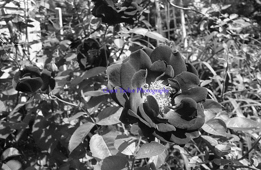
These images are of a rose bush outside my house. I feel the left image has a stronger composition with a good balance but I really like the angle of flower in the right image. Spot toning the flower could make these images stand out really well. I think the right image needed a shallower depth of field because the background has to much clutter.


This image of my guitar I feel is strong from a compositional stand point. The lines lead you through the image and the background has no clutter to pull you away from the guitar. The problem though is the image needs lightened a little bit and the right side needs cropped to remove the back of the chair it is sitting on. A sepia tone would greatly improve this image.

I photograph to see what something will look like photographed. - Garry Winogrand 

Thursday, July 1, 2010

Black and White Photo Assignment 4 Extra Images

These are the extra images from assignment four. I liked these images but not as much as the ones submitted for the assignment. Some of them are extras shot that did not focus on hands so they did not fit the theme.
This is another image of Jen. I like the cropping but it was not enough to fit into the hand theme. I like the lines of the table and the arm crossing the lines. It causes the arm to stand out so much. I wish the pavilion  with the people in the top right was not there.

This image was alright in my opinion. A few things would have made it stronger. Not having a glare on the paper would look better. Having Jen looking down at the paper would have also been better. Once again I did not watch the edges and my camera bag is in the bottom right corner. Easy to crop out but I shouldn't have to.

I really like both of these images but each one has a problem to me. I like the left image because of the shallow depth of field. The background on the right image takes away to much from the image. I like the right though because I can see more of the face. Either I moved or the subject moved but it is an improvement. I want the background on the left image and the foreground on the right.


This image I liked a little bit more than the one I submitted but I did not like the lighting. The bright spots in the background and take away a little. I think the hand could have been positioned a little higher in the frame to better take advantage of the rule of thirds.

This image might be my favorite of this subjects hands but it was not turned in because of a lighting problem on the hand. I corrected the light because it was really bad using Photoshop though for this image. The hand was white with splotches of dark and I was not successful with burning it in when making prints.


I like this image because of the repeating shapes going across the background. The image did not fit with the assignment though because it does not feel like the hand is the subject. The cement containers are much more prominent. Trimming the left side a little might make it a pretty good image of the containers though.

I just think it's important to be direct and honest with people about why you're photographing them and what you're doing.  After all, you are taking some of their soul.  ~Mary Ellen Mark


Wednesday, June 30, 2010

Black and White Photo Assignment 4

The fourth and final assignment for Black and White photography was Environmental Portraits. And environmental portrait is an image of a person where the other stuff in the image tells you about the person. After doing earlier assignments I had decided I really liked hands being photographed up close and I have a friend who is a Sign Language Interpreter. I figured she was a perfect subject because I would be able to photograph her hands and tell you about her career. I decided to do my whole assignment like that. I wanted to photograph just hands doing something a person does. Of course the person who is a sign language interpreter was unavailable to photograph but it was my inspiration for the assignment. This was also the first time I really shot a class assignment with a aver-arcing theme. I have tied my images together in previous assignments but this time I shot the assignment as a unified theme. 

This image is of Jen. She is a teacher so I thought about what made her a teacher. I wanted something like drawing on a blackboard but school was out for the summer so that was not going to happen. I figured grading would work well. I felt pretty strongly about this image. The lighting is nice and the entire image is almost in focus but the texture of the wood creates a good backdrop. It does not pull away from the image but if you look there is so much there. 

This image is of my friend Bryan. He works in a restaurant so I had to settle for photographing what he likes. Bryan likes poker so I chose to get hands holding cards. I photographed quite a few different poses and was happiest with this one. The image keeps your eye moving around it in circles and the lighting is great.

This image was my self portrait we were required to have. I love the guitar, even if I am bad at playing it, and I thought it would make a nice photograph. I shot it against a black background which could have been done better because the light reflected off of it in the bottom right corner. I think the contrast though is wonderful. The strings light up well against the black neck of the guitar.

This is a man working with cement. The texture of the hand is wonderful. So much detail. I am not completely happy with the image but I can't figure out why. It might be the left edge just barely has the person. I am unhappy about the hand being so far from the camera. My other images were all so close and this one was further away. 

One thing I learned doing this assignment was how hard it can be to photograph people. I am not a very social person so giving directions was hard for me and I need a lot more practice at. I hope to shoot more images of people to force myself into that situation.

When you photograph people in colour you photograph their clothes.  But when you photograph people in B&W, you photograph their souls!  ~Ted Grant


Sunday, June 27, 2010

First Post

This is my first post in what will hopefully be a successful project. I am going to begin by posting over the next few days images from my Black and White Photography class that I took during the first six weeks of the summer semester and talking a little bit about the assignments. The class had four assignment so each assignment will probably be a single post with the photographs I turned in as well as a follow up post of photographs that came out well while shooting but were not used. I hope to start shooting in digital soon and will be able to make lots of posts. I already have several ideas for projects I can't wait to try shooting.

I will always look forward to feedback on my images.