Showing posts with label Black and White. Show all posts

Friday, August 27, 2010

Black and White Band Photos

I decided to experiment a little with desaturating images today. I chose the images of this band because they were new images and band photos are often edited to be more dramatic.

The first image I just desaturated and added a slight posterize effect to the image. I also turned up the contrast a little and darkened the image. I think it really brings out the image nicely.


The next image I desaturated and posterized to a much greater degree. You can not get a great view unless you click on the image to see a larger version. It wiped out the background much better and gave a very dramatic look to the image. The strong contrast really brings the face out nicely.


I pushed the posterization even further with this image but edited out the guitar to not be affected. It really brings the guitar to the foreground. I think that it might have been better if the guitar was still colored but it works well.


I only desaturated this image. I choose to select the band members to not be desaturated to make them much more dominant. I do not think I am happy with the result. I think a triptych of this image with each member independently being the only part with saturation might be interesting but right now they all stand out. This would be fine but they take up to much of the image which diminishes the effect.

Friday, July 2, 2010

Extra Black and White Photos from class.

Through out the six week semester I often took photos that had nothing to do with the assignment. I grouped those photos that I liked into this post because they did not fit into the other posts. Sometimes I just take pictures because I think it will work, or I hope it will work.


This image is from the Wick Pollock Inn. It was bottles of what appeared to be olive oil or possibly some other oil. I like the lighting on this image. It highlights the plant inside the bottle very well and captures your attention. It might need to be darkened a little bit though.


This image is of a toy train. I really like the depth of field and the black and white gives a good tonal range to the train. It sort of appears creepy. The lighting worked well to just add a soft glow because I had very little direct light on it


.
I shot this image while walking through Boardman Park. It was a fire hydrant just off the side of the hike and bike trail. I shot it nearing sunset creating the strong lighting on the left side. It was amazing in color because it had a golden glow to it but I was shooting B&W film. A sepia tone added to this image might be able to recreate the color and the emotion of the shoot. The image also has pretty good balance.


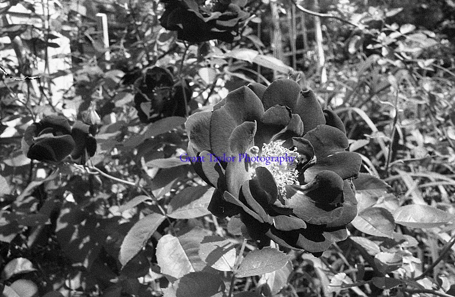
These images are of a rose bush outside my house. I feel the left image has a stronger composition with a good balance but I really like the angle of flower in the right image. Spot toning the flower could make these images stand out really well. I think the right image needed a shallower depth of field because the background has to much clutter.


This image of my guitar I feel is strong from a compositional stand point. The lines lead you through the image and the background has no clutter to pull you away from the guitar. The problem though is the image needs lightened a little bit and the right side needs cropped to remove the back of the chair it is sitting on. A sepia tone would greatly improve this image.

I photograph to see what something will look like photographed. - Garry Winogrand 

Thursday, July 1, 2010

Black and White Photo Assignment 4 Extra Images

These are the extra images from assignment four. I liked these images but not as much as the ones submitted for the assignment. Some of them are extras shot that did not focus on hands so they did not fit the theme.
This is another image of Jen. I like the cropping but it was not enough to fit into the hand theme. I like the lines of the table and the arm crossing the lines. It causes the arm to stand out so much. I wish the pavilion  with the people in the top right was not there.

This image was alright in my opinion. A few things would have made it stronger. Not having a glare on the paper would look better. Having Jen looking down at the paper would have also been better. Once again I did not watch the edges and my camera bag is in the bottom right corner. Easy to crop out but I shouldn't have to.

I really like both of these images but each one has a problem to me. I like the left image because of the shallow depth of field. The background on the right image takes away to much from the image. I like the right though because I can see more of the face. Either I moved or the subject moved but it is an improvement. I want the background on the left image and the foreground on the right.


This image I liked a little bit more than the one I submitted but I did not like the lighting. The bright spots in the background and take away a little. I think the hand could have been positioned a little higher in the frame to better take advantage of the rule of thirds.

This image might be my favorite of this subjects hands but it was not turned in because of a lighting problem on the hand. I corrected the light because it was really bad using Photoshop though for this image. The hand was white with splotches of dark and I was not successful with burning it in when making prints.


I like this image because of the repeating shapes going across the background. The image did not fit with the assignment though because it does not feel like the hand is the subject. The cement containers are much more prominent. Trimming the left side a little might make it a pretty good image of the containers though.

I just think it's important to be direct and honest with people about why you're photographing them and what you're doing.  After all, you are taking some of their soul.  ~Mary Ellen Mark


Wednesday, June 30, 2010

Black and White Photo Assignment 4

The fourth and final assignment for Black and White photography was Environmental Portraits. And environmental portrait is an image of a person where the other stuff in the image tells you about the person. After doing earlier assignments I had decided I really liked hands being photographed up close and I have a friend who is a Sign Language Interpreter. I figured she was a perfect subject because I would be able to photograph her hands and tell you about her career. I decided to do my whole assignment like that. I wanted to photograph just hands doing something a person does. Of course the person who is a sign language interpreter was unavailable to photograph but it was my inspiration for the assignment. This was also the first time I really shot a class assignment with a aver-arcing theme. I have tied my images together in previous assignments but this time I shot the assignment as a unified theme. 

This image is of Jen. She is a teacher so I thought about what made her a teacher. I wanted something like drawing on a blackboard but school was out for the summer so that was not going to happen. I figured grading would work well. I felt pretty strongly about this image. The lighting is nice and the entire image is almost in focus but the texture of the wood creates a good backdrop. It does not pull away from the image but if you look there is so much there. 

This image is of my friend Bryan. He works in a restaurant so I had to settle for photographing what he likes. Bryan likes poker so I chose to get hands holding cards. I photographed quite a few different poses and was happiest with this one. The image keeps your eye moving around it in circles and the lighting is great.

This image was my self portrait we were required to have. I love the guitar, even if I am bad at playing it, and I thought it would make a nice photograph. I shot it against a black background which could have been done better because the light reflected off of it in the bottom right corner. I think the contrast though is wonderful. The strings light up well against the black neck of the guitar.

This is a man working with cement. The texture of the hand is wonderful. So much detail. I am not completely happy with the image but I can't figure out why. It might be the left edge just barely has the person. I am unhappy about the hand being so far from the camera. My other images were all so close and this one was further away. 

One thing I learned doing this assignment was how hard it can be to photograph people. I am not a very social person so giving directions was hard for me and I need a lot more practice at. I hope to shoot more images of people to force myself into that situation.

When you photograph people in colour you photograph their clothes.  But when you photograph people in B&W, you photograph their souls!  ~Ted Grant